Apple tends to bring improvements to the UI on each major platform release. One of these nice improvements is the new Action Menu List. The Action Menu List is a nicely animated menu, typically under a button at the bottom left of an app’s message entry screen. When building for iOS 17 and beyond, you’ll want to build a UI that takes the best of what Apple shows us.
Did you know it’s possible to achieve the same look with Stream? Let’s recreate the Apple-designed user interface on top of the Stream Chat UI Component Library.
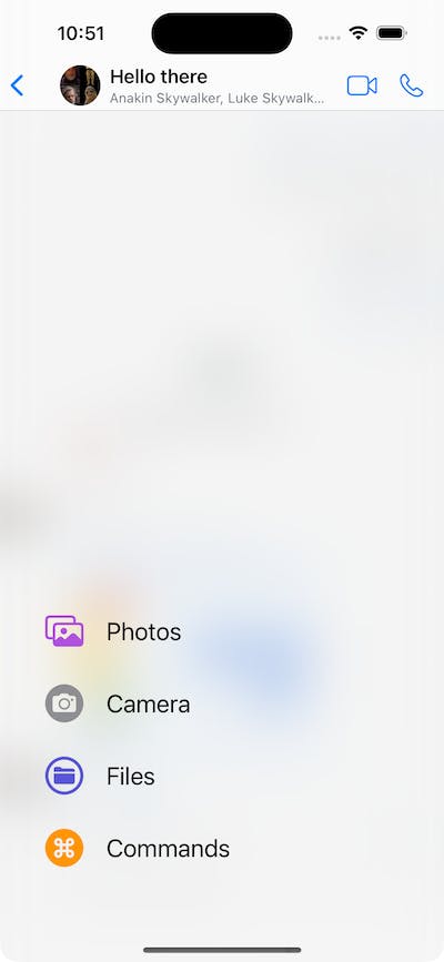
We will be building a UI that looks as follows:

Please note this article is based on one of several UI cookbooks we have available in our documentation.
To get started, you must have a codebase available on the Stream Chat SDK. To do that, first run through the SwiftUI Chat tutorial. Or grab the finished tutorial codebase from our GitHub repository.
A fully working demo implementation of this code is available on GitHub in our SwiftUI Demo Application.
Begin by creating a new file AppleMessageComposerView, and paste the following code.
import StreamChat
import StreamChatSwiftUI
import SwiftUI

struct AppleMessageComposerView<Factory: ViewFactory>: View, KeyboardReadable {}
The AppleMessageComposerView will be a SwiftUI view with a generic over a ViewFactory protocol. The ViewFactory protocol is part of the Stream Chat UI Component Library and is where you can indicate that you would like specific views to be overridden by one of your own implementations. If you implement the ViewFactory and provide a View adhering to the interface indicated by the ViewFactory protocol functions, you should end up with your custom-implemented view integrating seamlessly into the rest of Stream’s UI Component Library. We also require the implementation of Stream’s KeyboardReadable protocol. The KeyboardReadable protocol provides your custom view with useful keyboard handling.
The next step is to define a few properties we will need during the implementation of our custom view. Make sure to paste the following code in the body of the AppleMessageComposerView we just created.
    @Injected(\.colors) private var colors
    @Injected(\.fonts) private var fonts

    // Initial popup size, before the keyboard is shown.
    @State private var popupSize: CGFloat = 350
    @State private var composerHeight: CGFloat = 0
    @State private var keyboardShown = false

    private var factory: Factory
    private var channelConfig: ChannelConfig?

    @State private var state: AnimationState = .initial
    @State private var listScale: CGFloat = 0

    @StateObject var viewModel: MessageComposerViewModel

    var onMessageSent: () -> Void
The @Injected properties provide access to StreamChat's SDK specific objects, such as fonts and colors. It is Stream’s way of centralizing themable properties across the entire UI Component library. By adhering to the content of these injected properties, your custom component will take part in the theming process of Stream’s UI Components.
The @State properties allow us to track the view's state, such as the size of the composer popup and whether it's expanded. We also need a MessageComposerViewModel view model to handle the entered text, validation, presentation logic, as well as the sending of a message. We will reuse the MessageComposerViewModel available in the UI Components library.
Let’s finish the AppleMessageComposerView first by adding an init method.
public init(
    viewFactory: Factory,
    viewModel: MessageComposerViewModel? = nil,
    channelController: ChatChannelController,
    onMessageSent: @escaping () -> Void
) {
    factory = viewFactory
    channelConfig = channelController.channel?.config
    let vm = viewModel ?? ViewModelsFactory.makeMessageComposerViewModel(
        with: channelController,
        messageController: nil
    )
    _viewModel = StateObject(
        wrappedValue: vm
    )
    self.onMessageSent = onMessageSent
}
Our view still doesn’t have a proper `body ' yet. We will create a horizontal stack with a plus button and a text input field as the main content of the composer. When the user picks the attachment button, the composer should expand by moving up and providing the user with buttons allowing attachment of supported attachment types.

Showing this requires us to add a vertical stack to contain the picker in a compact state. When the attachment type is activated, we must move it up with an animation.
So, to reiterate, the components in the composer to keep an eye on are the plus button, input view, and bottom attachment picker.
Now we discussed what we aim for, let’s add the body of our AppleMessageComposerView by pasting below body function into the AppleMessageComposerView.
var body: some View {
    VStack(spacing: 0) {
        HStack(alignment: .bottom) {
            plusButton

            ComposerInputView(
                factory: DefaultViewFactory.shared,
                text: $viewModel.text,
                selectedRangeLocation: $viewModel.selectedRangeLocation,
                command: $viewModel.composerCommand,
                addedAssets: viewModel.addedAssets,
                addedFileURLs: viewModel.addedFileURLs,
                addedCustomAttachments: viewModel.addedCustomAttachments,
                quotedMessage: .constant(nil),
                maxMessageLength: channelConfig?.maxMessageLength,
                cooldownDuration: viewModel.cooldownDuration,
                onCustomAttachmentTap: viewModel.customAttachmentTapped(_:),
                removeAttachmentWithId: viewModel.removeAttachment(with:)
            )
            .overlay(
                viewModel.sendButtonEnabled ? sendButton : nil
            )
        }
        .padding(.all, 8)

        factory.makeAttachmentPickerView(
            attachmentPickerState: $viewModel.pickerState,
            filePickerShown: $viewModel.filePickerShown,
            cameraPickerShown: $viewModel.cameraPickerShown,
            addedFileURLs: $viewModel.addedFileURLs,
            onPickerStateChange: viewModel.change(pickerState:),
            photoLibraryAssets: viewModel.imageAssets,
            onAssetTap: viewModel.imageTapped(_:),
            onCustomAttachmentTap: viewModel.customAttachmentTapped(_:),
            isAssetSelected: viewModel.isImageSelected(with:),
            addedCustomAttachments: viewModel.addedCustomAttachments,
            cameraImageAdded: viewModel.cameraImageAdded(_:),
            askForAssetsAccessPermissions: viewModel.askForPhotosPermission,
            isDisplayed: viewModel.overlayShown,
            height: viewModel.overlayShown ? popupSize : 0,
            popupHeight: popupSize
        )
    }
    .background(
        GeometryReader { proxy in
            let frame = proxy.frame(in: .local)
            let height = frame.height
            Color.clear.preference(key: HeightPreferenceKey.self, value: height)
        }
    )
    .onPreferenceChange(HeightPreferenceKey.self) { value in
        if let value = value, value != composerHeight {
            self.composerHeight = value
        }
    }
    .onReceive(keyboardWillChangePublisher) { visible in
        if visible && !keyboardShown {
            if viewModel.composerCommand == nil {
                withAnimation(.easeInOut(duration: 0.02)) {
                    viewModel.pickerTypeState = .expanded(.none)
                }
            }
        }
        keyboardShown = visible
    }
    .onReceive(keyboardHeight) { height in
        if height > 0 && height != popupSize {
            self.popupSize = height - bottomSafeArea
        }
    }
    .overlay(
        viewModel.showCommandsOverlay ?
            factory.makeCommandsContainerView(
                suggestions: viewModel.suggestions,
                handleCommand: { commandInfo in
                    viewModel.handleCommand(
                        for: $viewModel.text,
                        selectedRangeLocation: $viewModel.selectedRangeLocation,
                        command: $viewModel.composerCommand,
                        extraData: commandInfo
                    )
                }
            )
            .offset(y: -composerHeight)
            .animation(nil) : nil,
        alignment: .bottom
    )
    .modifier(factory.makeComposerViewModifier())
    .accessibilityElement(children: .contain)
    .overlay(
        ComposerActionsView(viewModel: viewModel, state: $state, listScale: $listScale)
            .offset(y: -(UIScreen.main.bounds.height - composerHeight) / 2 + 80)
            .allowsHitTesting(state == .expanded)
    )
}
If you look closely, we add a few modifiers to the view as well. With these, we read the height of the popup, keyboard keyboard-related actions and they help us show the commands overlay.
Pay special attention to the last overlay modifier; this is the one that helps us show the composer actions view with an animation.

We still need to create one more thing to make it all work. And that’s the Composer Actions View.
To keep things simple, we will put everything in the file we created earlier. To get the Composer Action View started we begin by defining what an action is. Create a new struct called ComposerAction, with the following properties.
struct ComposerAction: Equatable, Identifiable {
    static func == (lhs: ComposerAction, rhs: ComposerAction) -> Bool {
        lhs.id == rhs.id
    }

    var imageName: String
    var text: String
    var color: Color
    var action: () -> Void
    var id: String {
        "\(imageName)-\(text)"
    }
}
This struct will contain the required information needed to show action in the list of actions.
We got the struct for the data to display in an action, now let’s define how an action should look on screen. Let’s create the ComposerActionsView. The composer actions view has a blurred background because it looks cool and it seems that’s what Apple does as well. On top of the blurred background, we will display the composer actions we want to offer to our end users. We will also add a small animation that will make the list bounce a little bit by scaling the list and adjusting the offset during the animation.
Paste the following code below the ComposerAction struct we created earlier.
struct ComposerActionsView: View {

    @ObservedObject var viewModel: MessageComposerViewModel

    @State var composerActions: [ComposerAction] = []

    @Binding var state: AnimationState
    @Binding var listScale: CGFloat

    var body: some View {
        ZStack(alignment: .bottomLeading) {
            Color.white.opacity(state == .initial ? 0.2 : 0.5)

            BlurredBackground()
                .opacity(state == .initial ? 0.0 : 1.0)

            VStack(alignment: .leading, spacing: 30) {
                ForEach(composerActions) { composerAction in
                    Button {
                        withAnimation {
                            state = .initial
                            composerAction.action()
                        }
                    } label: {
                        ComposerActionView(composerAction: composerAction)
                    }
                }
            }
            .padding(.leading, 40)
            .padding(.bottom, 84)
            .scaleEffect(
                CGSize(
                    width: state == .initial ? 0 : 1,
                    height: state == .initial ? 0 : 1
                )
            )
            .offset(
                x: state == .initial ? -75 : 0,
                y: state == .initial ? 90 : 0
            )
        }
        .onAppear {
            setupComposerActions()
        }
        .edgesIgnoringSafeArea(.all)
        .onTapGesture {
            withAnimation(.bouncy) {
                switch state {
                case .initial:
                    listScale = 1
                    state = .expanded
                case .expanded:
                    listScale = 0
                    state = .initial
                }
            }
        }
    }
}
Notice the onAppear modifier, we set up our composer actions when the view appears. There is some work involved with setting up the actions, so we factored it out in a separate function. Let’s add the implementation of the setupComposerActions next.
private func setupComposerActions() {
    let imageAction: () -> Void = {
        viewModel.pickerTypeState = .expanded(.media)
        viewModel.pickerState = .photos
    }
    let commandsAction: () -> Void = {
        viewModel.pickerTypeState = .expanded(.instantCommands)
    }
    let filesAction: () -> Void = {
        viewModel.pickerTypeState = .expanded(.media)
        viewModel.pickerState = .files
    }
    let cameraAction: () -> Void = {
        viewModel.pickerTypeState = .expanded(.media)
        viewModel.pickerState = .camera
    }

    composerActions = [
        ComposerAction(
            imageName: "photo.on.rectangle",
            text: "Photos",
            color: .purple,
            action: imageAction
        ),
        ComposerAction(
            imageName: "camera.circle.fill",
            text: "Camera",
            color: .gray,
            action: cameraAction
        ),
        ComposerAction(
            imageName: "folder.circle",
            text: "Files",
            color: .indigo,
            action: filesAction
        ),
        ComposerAction(
            imageName: "command.circle.fill",
            text: "Commands",
            color: .orange,
            action: commandsAction
        )
    ]
}
The actions we define influence the state of the picker and its type based on the user’s input.
We are not done yet. We have code to show a list of actions, but we have not yet defined how a single action should look. So our next task is to implement the ComposerActionView, which will describe how an action should look.
struct ComposerActionView: View {

    private let imageSize: CGFloat = 34

    var composerAction: ComposerAction

    var body: some View {
        HStack(spacing: 20) {
            Image(systemName: composerAction.imageName)
                .resizable()
                .scaledToFit()
                .foregroundColor(composerAction.color)
                .frame(width: imageSize, height: imageSize)

            Text(composerAction.text)
                .foregroundColor(.primary)
                .font(.title2)
        }
    }
}
We have now created all the custom UI we need. Along the way we called upon a few utility types that helped us define how the blurred background should look and a few other details. Let’s add these utility types and then move on to integrating everything into the rest of our codebase.
Add the following code to the bottom of the file we’ve been working on the entire tutorial.
struct BlurredBackground: View {
    var body: some View {
        Color.clear
            .frame(
                width: UIScreen.main.bounds.width,
                height: UIScreen.main.bounds.height
            )
            .background(
                .ultraThinMaterial,
                in: RoundedRectangle(cornerRadius: 16.0)
            )
    }
}

struct HeightPreferenceKey: PreferenceKey {
    static var defaultValue: CGFloat? = nil

    static func reduce(value: inout CGFloat?, nextValue: () -> CGFloat?) {
        value = value ?? nextValue()
    }
}

enum AnimationState {
    case initial, expanded
}The last thing we need to take care of is making our new custom composer available to the Stream Chat SwiftUI SDK. To do this we will need a custom view factory. Create a new file called CustomViewFactory and add the makeMessageComposerViewType from the ViewFactory protocol.
import StreamChat
import StreamChatSwiftUI
import SwiftUI

class CustomViewFactory: ViewFactory {

    @Injected(\.chatClient) public var chatClient

    func makeMessageComposerViewType(
        with channelController: ChatChannelController,
        messageController: ChatMessageController?,
        quotedMessage: Binding<ChatMessage?>,
        editedMessage: Binding<ChatMessage?>,
        onMessageSent: @escaping () -> Void
    ) -> some View {
        AppleMessageComposerView(
            viewFactory: self,
            channelController: channelController,
            onMessageSent: onMessageSent
        )
    }
}
Depending on which components you use, you should provide this view factory, replacing the default one. For example, if you are using a ChatChannelListView, you can pass it in the creation process.
var body: some Scene {
    WindowGroup {
        ChatChannelListView(viewFactory: CustomViewFactory())
    }
}
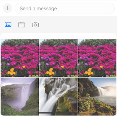
If you run your app now, you should see the updated composer, as shown on the screenshot.

This article aimed to show you how easy it is to add customized components to our SwiftUI Chat SDK in your application. We’ve looked at Apple’s composer view as an example of how we can customize any component to look like anything you can come up with.
Hopefully, you will take away from this article how flexible and powerful our SwiftUI Chat SDK is. Also, have a look at our cookbooks in our documentation for other inspiring examples of how to customize our SDKs.
Also note, that our Video SDK has similar capabilities as our Chat SDK in regards to flexibility and customization.